Overview
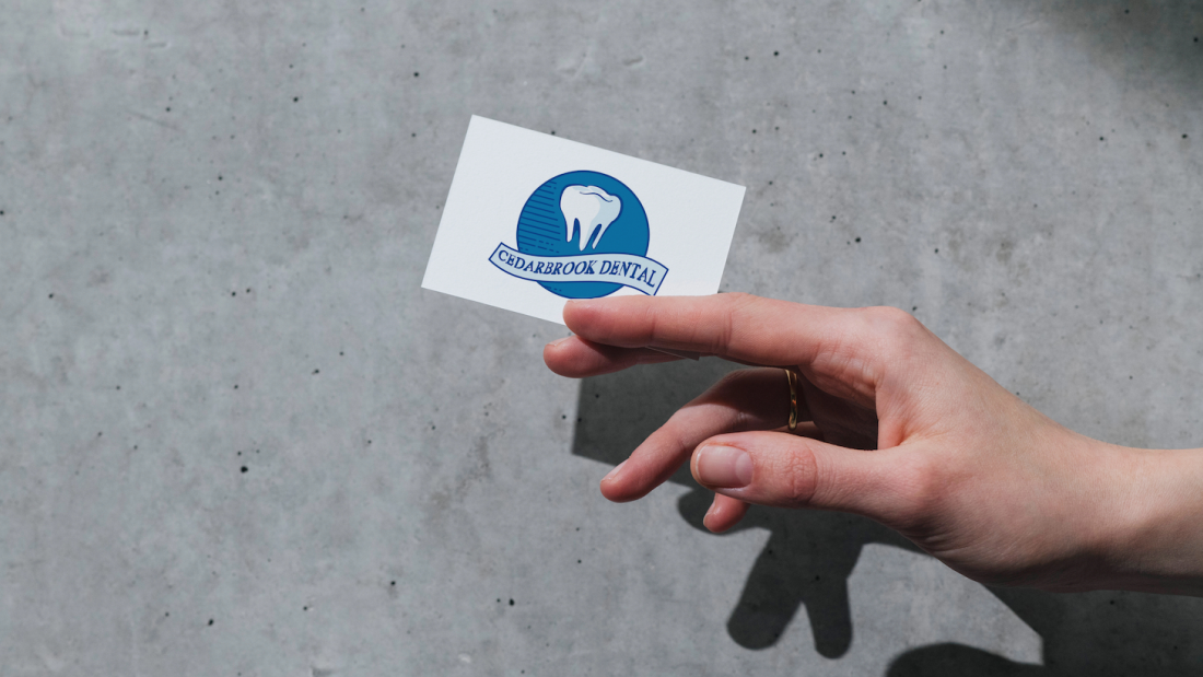
Cedarbrook Dental needed a logo that felt professional, welcoming, and trustworthy, while remaining approachable for patients of all ages. The goal was to create a visual identity that communicated high-quality dental care without feeling clinical or intimidating.
This logo was designed to work seamlessly across digital platforms, print materials, and in-office signage, ensuring consistent brand recognition.
Objectives
- Establish a friendly and trustworthy visual identity
- Avoid overly clinical or sterile aesthetics
- Create a logo that feels modern yet timeless
- Ensure versatility across web, print, and signage
Concept
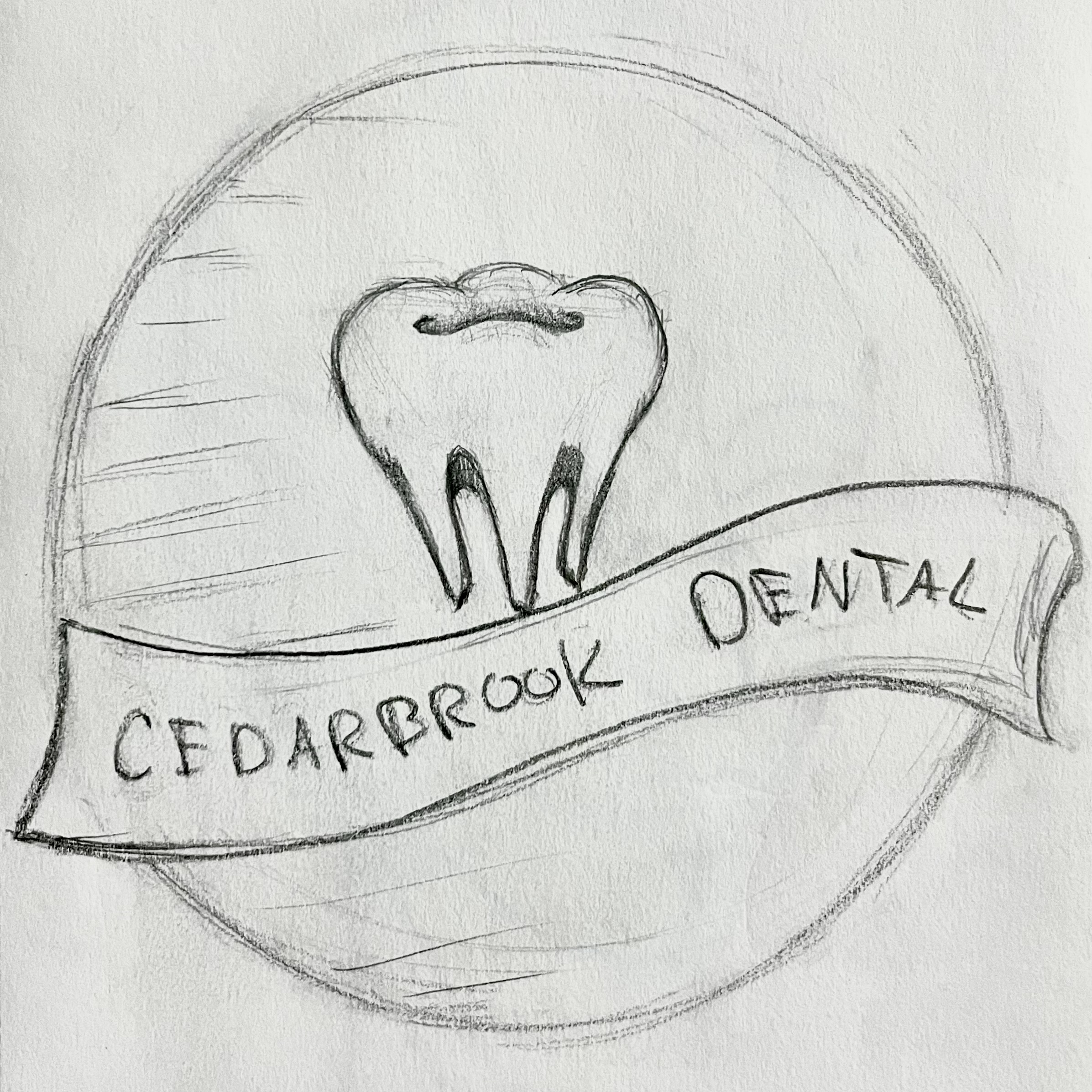
- Clean tooth icon enclosed in a circular badge to symbolize care and protection
- Circular shape reinforcing reliability and completeness
- Soft curves creating a welcoming, patient-friendly impression
- Ribbon banner adding a classic, established feel to the brand
Design & Branding Process
Brand Positioning
- Focused on balancing professionalism with warmth
- Ensured the brand appealed to patients of all ages
Brand Positioning
- Focused on balancing professionalism with warmth
- Ensured the brand appealed to patients of all ages
Visual Balance
- Combined soft shapes with structured elements
- Avoided both overly playful and overly clinical aesthetics
Typography & Color Palette
- Color Palette: Shades of blue and white representing cleanliness, trust, calmness, and medical professionalism
- Contrast Balance: Darker blues provide credibility while lighter tones maintain approachability
- Typography: Serif-style lettering for a traditional, trustworthy feel with strong readability
Versatility
- Designed for scalability across digital and print formats
- Maintained clarity and legibility at small sizes
Challenges
- Tone Balance: Creating a logo that felt friendly without appearing childish
- Industry Expectations: Avoiding overly sterile dental branding clichés
- Professionalism: Maintaining credibility while staying welcoming
Final Outcome
- Delivered a professional, welcoming brand identity
- Created a cohesive logo system suitable for digital and print use
- Helped position Cedarbrook Dental as trustworthy and patient-focused